Tampilkan postingan dengan label scale. Tampilkan semua postingan

Adding spice to your decor.

If you've decided your decor is predictable after reading my last post, and you want to spice things up a little this post is for you.

Here goes....

1. Rebel against  over-matching  accessories

If you choose an accent colour everything does not need to be that colour!   Consider breaking up the accessory load with a complementary colour scheme  or by choosing several colours side by side on the colour wheel.


A lively mix of pattern and colours brings energy to neutral spaces. Imagine this room without the colour.


And for those who like a more traditional space, here's an adventurous mix of patterns to create a very soft look.  Notice how the orange is repeated in the flowers, and the pink in the flowers on table and the books, but the yellow stands alone. That makes it a 3, 2 and 1 colour distribution.  Subtle but everything counts for interest and variety. Now I want to repaint the walls soft white.


2. Mix old and new together in one space 


Briggs Solomon 


 3.  Display meaningful objects 


Collections always denote personal interests, and  they are  markers of time and events in the collector's life, e.g.,  when was something purchased, where etc. You are really creating a personal timeline and history when you display a collection of objects. 


The trick with displaying collections is to come up with a way to do it that looks artful rather than cluttered. 


4. Throw in something unexpected or quirky


I am always attracted to vignettes that tell a story like the one above.  Is the leather saddle bag connected to hobbies or is it random? Perhaps it's for bike riding, e.g., a messenger bag.  What are the tall wooden pieces?  Has the owner seen New York from the air or is it just a visual adventure? 

source 

Oh, art you have such power to present and question.  Putting this large piece on the floor brings it to viewing level, but it also places it where a foot is usually found in a home.  


Layering, complementary colours, interesting objects and a bit of whimsey.  Perfectly composed and inviting. 

5. Mix styles 


Mixing styles isn't for everyone, but it always creates comparisons that are interesting.  In this space the hard edged, lucite table  is a total contrast to the softness of everything else.  It is there without being there visually.  

6. Use common objects/materials  in new ways 


IF you like the idea of a clock table there's every conceivable take on this on Pinterest.  Check them out here .


If you have a thing for rulers, that works too. 


7. Mix patterns and textures to create visual excitement 


8. Break up furniture sets 


 Furniture sets were conceived for the person who wants a ready made room without the fuss of looking for separate pieces.  With that ease comes predictability.   If you are interested in variety and energy in a space,  take away one or more of your set pieces and introduce something new.  In the room above,  only the chairs match,  but it all works very well together.


9. Go for contrast and drama  


 Of course black and white is the ultimate contrast.  Add any colour to it and you have instant interest.  How do you feel about red and black?  Perhaps you would like white, black and yellow better.


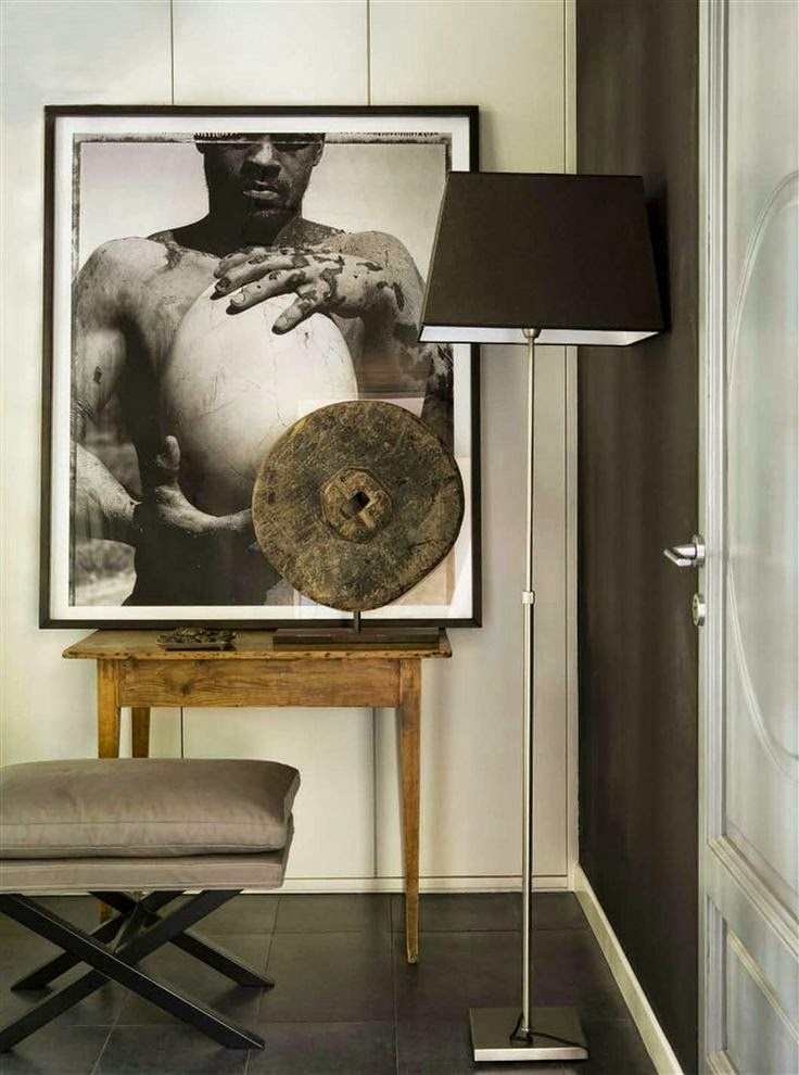
10.  Play with scale to create a statement 


Playing with larger scale pieces works best in more minimal spaces where the size and form of objects are highlighted without  the distraction of a lot of objects. 


If you're  choosing a large painting for a space make sure you have some bridging heights like the plant above to connect all the objects in the space. The range of patterns and number of pillows below the artwork also ads visual weight to balance out the large work.  Manipulating scale can be a tricky business.


source 

So many ways to create interesting spaces.  Do you have a favourite from this list? 

Are you a design rebel?


What's your first instinct if someone tells says you shouldn't do something?

Do you automatically want to do it?  I do! 

 Most people would agree that there are rules/guidelines in interior design. They impact decisions about all sorts of things,  e.g.,  hanging lights, choosing the right scale furniture, selecting colour schemes, etc.   I guess following them is a little like following a recipe - you get a predictable result. Someone else has done all the thinking for you which makes it easy but, you also get a very generic looking space where everything looks controlled.

 I always think about those generic spaces  as the "Pinterest look" . You know  the rooms, all  beautifully organized, cutely accessorized with whatever is trendy at the time, and perfectly matched.   Does that make them wrong?  Definitely not.  I firmly believe we should all live in spaces that make us happy and comfortable.   What I am saying is that there are options in design that produce interesting, one of a kind spaces that are  usually achieved by playing around with design elements and principles. They are not for everyone.

 Take the room below.....

 breaking design rules, scale,
source

  Have a close look at this space  and decide what you like or don't like about it.  Check out my thoughts  at the end of this post. There are no right or wrong answers.

 How closely you adhere to rules is dependent on what results you want to achieve, how well you understand the elements/ principles  of design,  and how creative you are at applying them.  You can do anything in decorating, you just need to act bravely, and figure out how to pull it off.  But, before you can break the rules you have to know them.

Can you spot which  rules/guidelines were  thrown to the four winds in these rooms? 

1.
 breaking design rules, mixing styles, modern and traditional,
 source

 breaking design rules, mixing styles, modern, traditional
source


2.
 mixing metals, breaking design rules
source

 mixing metals, breaking design rules
source

 3.

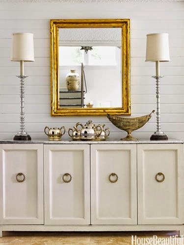
breaking design rules, scale, accessories
 source

 breaking design rules, scale


4.

breaking design rules, monochromatic schemes, neutral schemes
 source

 breaking design rules, neutral spaces, monochromatic schemes

source

5.

breaking design rules, mixing wood tones,
 source

 breaking design rules, mixing wood tones
source


6.


breaking design rules, dark walls, small spaces


breaking design rules, small spaces, bright colours


Here are the results: 

breaking design rules, mixing styles, modern and traditional,  breaking design rules, mixing styles, modern, traditional

1. Stick to one style 
 These spaces show that when you mix traditional and modern the juxtaposition draws attention to both.  If only one style was used the various elements would be lost in their sameness. I particularly like the richness of wood and lots of curves with modern furnishings.  Of course art of any style works in any space.  

mixing metals, breaking design rules mixing metals, breaking design rules

2. Use consistent finishes (don't mix metals)
This is definitely a good place to start your little rebellion.  You certainly can mix metals. Just make sure you have some of each one in the space.  Think about a piece of jewellery that uses white gold, pink gold and yellow gold. It works. Check out this post on the topic.

 breaking design rules, scale breaking design rules, scale, accessories

3. Pay attention to scale when selecting furniture/objects
I have to admit this is the one I have the most difficult time ignoring because  I am so attuned to scale considerations in drawing and painting.  I think I also have a  thing about objects too large bearing down on me. They make me uncomfortable. Large scale objects make riveting focal points. You can also have objects that are too small in scale, and end up looking insignificant and/or cluttered. Scale is usually the issue when a client tells me there is something wrong with a space, but he/she can't name it.

breaking design rules, monochromatic schemes, neutral schemes   breaking design rules, neutral spaces, monochromatic schemes

 
4. Every room needs an accent colour
Definitely not! Monochromatic rooms are so relaxing and depend on value changes and texture to wow.  If you want a quiet room, forget the pops of colour.

 breaking design rules, mixing wood tones  breaking design rules, mixing wood tones,

5. Keep wood tones consistent
When you slavishly adhere to this dictate you end up with a very boring space.  Check out this post for ways to mix wood tones effectively.

breaking design rules, dark walls, small spacesbreaking design rules, small spaces, bright colours

6. Choose light colours for small spaces
That would be your first instinct, but the two rooms in #6 shows that breaking this rule produces distinctive and very different spaces.  Sorry, but I couldn't live in either of them.  I am a neutral colour gal in my own home. This post provides various options for painting small spaces.

How did you do?

And now back to the reflection pic....

 
There's no doubt this space breaks a lot of rules, but it sure is memorable, and no one could call it boring. 

  •  styles are mixed freely, moving from traditional to modern;
  •  the colour scheme is monochromatic, no accent colours here;
  • scale is manipulated big time in the high back chairs, plant, circular light fixture as well as in the smaller lamp shades in adjoining room;
  • wood tones are liberally mixed.

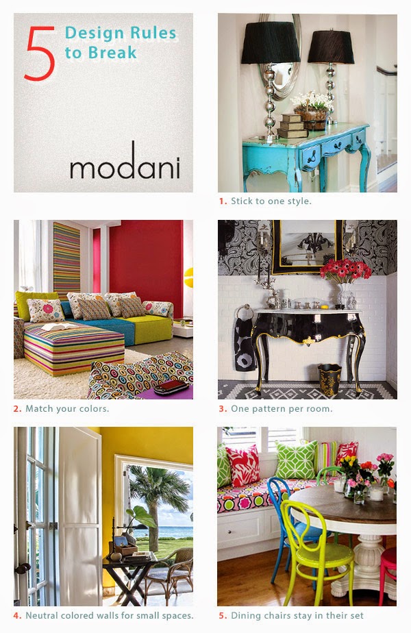
And here's another take on some of the points above and few new ones. Modani modern furniture specializes in modern furniture and accessories.  Check them out online or at their newly opened modern furniture store in Toronto. Remember you can combine modern elements with any decor.


breaking design rules, modani, modern furniture  
How do you feel about breaking design rules? 

It's all about scale


  Designers/decorators are like acrobats, always juggling the elements and principles of design to create  inviting and interesting spaces. These tools of the trade come easily when you spend your time immersed in design, but for the average person it takes a little more effort to pull together a truly well designed space. 

 One of the the most noticeable problems I see in many spaces  is a  lack of understanding/ application/ use of  proportion and scale. It's a biggie in my book. Playing with scale can be used to great effect, but  when done wrong it can creates visually uncomfortable spaces.


 Proportion and scale go hand in hand since both relate to size and shape. Proportion is about the ratio between the size of one part to another, and scale is how the size of one objects relates to another, to the space as a whole and  to the people who will inhabit the space . My best example of  disregarding scale is choosing a large overstuffed love seat, chair and sofa for a small space. Then imagine a petite couple living there! 


Yea or Nah, let's see what we think about these.... I've had my say....  (all images from my Pinterest board Pondering Scale)


When I feel that the scale of something is off I say the object in question looks "uncomfortable".  In the room above the clock looks very uncomfortable.  It has no room to breathe because it is totally hemmed in by the  the headboard and the night table.  Is it a great clock?  Yes...  Would it look better in another setting ?  I think so.  How about you? 

The urn next to the dresser  looks out of place in this space. While it is quite stunning and it fits in with the style of the other objects and furniture, it  needs a much larger space to shine.  It works with the scale of the dark dresser with TV on top, but it it just too large for the space between the two pieces of furniture.


 This is an elegantly designed space, but I am fussy about the scale of pillows to chairs/sofas.  To my mind they have to look good and be functional.  How would you ever sit on this chair?  Pillow to floor immediately!  A 12 in square or a lumbar pillow works well in a side chair.  If you want to add lots of pattern consider a throw folded over the back of a chair.


 We don't usually see pendants this large but in this space I think they work very well.  It helps that they are transparent.  The choice of  oversized pendants seems to be on the rise lately. 


  You will often see a small decorative mirror over a bed, but it rarely works to best effect.  I would choose a round mirror for this beautiful room and I quite like the gold finish.  I think it needs to be a tad larger.  Rule of thumb is 2/3 the width of the headboard.  Where  this space is  banked by two windows
 you could go a tad smaller that that but not as little as half which is what we have in the room above. 


 When you have a  very tall headboard or posts you need to scale up your lamp accordingly. I want this lamp to have a larger base and only slightly more height. It needs more presence.  Everything else about this space is just lovely.  

  I love the burlap with stripe and the glass base of this lamp,  but it gives  that uncomfortable feeling again.  How do you know which shade size (height and width) to choose for a lamp?   There are all kinds of formulas for this, but consider a shade that is  roughly  2/3 the height of the  lamp base up to where the socket begins and twice the width of the base. The shade above is not too bad height wise, but it needs to have a much larger shade diameter.  


I seem to have a lot of lamp issues in this post.   Great lamp but not on this cabinet and what about placing the little plant  next to it? This lamp needs SPACE!

 Another lovely space with pristine white everywhere.  If this table doubles as a place to eat, I guess function will outweigh form.  Otherwise a coffee table should be roughly 2/3 the length of the sofa.


 In my world you should not have to reach up to a coffee table or any table for that matter.  It is actually dangerous if you have a hot drink and knock it enroute.  A coffee table is usually the height of the sofa cushion, a tad lower or higher. Modern coffee tables are often much lower than the top of the sofa cushion.

The floral arrangement is also very high for the middle of a space.  Safety again. There's living in a space and then there are photo shoots.  Not the same thing at all.


This may only be a pet peeve of mine because I see tall tables next to seating  in home decor magazines and online.This smallish love seat with delicate arms is overpowered by this  much taller table. It might not be quite so bad if the lamp weren't towering over everything. 


I can't imagine why one would want an art work touching the ceiling and a sofa.  I guess the designer could be making some statement about insignificance!