Adding spice to your decor.

If you've decided your decor is predictable after reading my last post, and you want to spice things up a little this post is for you.

Here goes....

1. Rebel against  over-matching  accessories

If you choose an accent colour everything does not need to be that colour!   Consider breaking up the accessory load with a complementary colour scheme  or by choosing several colours side by side on the colour wheel.


A lively mix of pattern and colours brings energy to neutral spaces. Imagine this room without the colour.


And for those who like a more traditional space, here's an adventurous mix of patterns to create a very soft look.  Notice how the orange is repeated in the flowers, and the pink in the flowers on table and the books, but the yellow stands alone. That makes it a 3, 2 and 1 colour distribution.  Subtle but everything counts for interest and variety. Now I want to repaint the walls soft white.


2. Mix old and new together in one space 


Briggs Solomon 


 3.  Display meaningful objects 


Collections always denote personal interests, and  they are  markers of time and events in the collector's life, e.g.,  when was something purchased, where etc. You are really creating a personal timeline and history when you display a collection of objects. 


The trick with displaying collections is to come up with a way to do it that looks artful rather than cluttered. 


4. Throw in something unexpected or quirky


I am always attracted to vignettes that tell a story like the one above.  Is the leather saddle bag connected to hobbies or is it random? Perhaps it's for bike riding, e.g., a messenger bag.  What are the tall wooden pieces?  Has the owner seen New York from the air or is it just a visual adventure? 

source 

Oh, art you have such power to present and question.  Putting this large piece on the floor brings it to viewing level, but it also places it where a foot is usually found in a home.  


Layering, complementary colours, interesting objects and a bit of whimsey.  Perfectly composed and inviting. 

5. Mix styles 


Mixing styles isn't for everyone, but it always creates comparisons that are interesting.  In this space the hard edged, lucite table  is a total contrast to the softness of everything else.  It is there without being there visually.  

6. Use common objects/materials  in new ways 


IF you like the idea of a clock table there's every conceivable take on this on Pinterest.  Check them out here .


If you have a thing for rulers, that works too. 


7. Mix patterns and textures to create visual excitement 


8. Break up furniture sets 


 Furniture sets were conceived for the person who wants a ready made room without the fuss of looking for separate pieces.  With that ease comes predictability.   If you are interested in variety and energy in a space,  take away one or more of your set pieces and introduce something new.  In the room above,  only the chairs match,  but it all works very well together.


9. Go for contrast and drama  


 Of course black and white is the ultimate contrast.  Add any colour to it and you have instant interest.  How do you feel about red and black?  Perhaps you would like white, black and yellow better.


10.  Play with scale to create a statement 


Playing with larger scale pieces works best in more minimal spaces where the size and form of objects are highlighted without  the distraction of a lot of objects. 


If you're  choosing a large painting for a space make sure you have some bridging heights like the plant above to connect all the objects in the space. The range of patterns and number of pillows below the artwork also ads visual weight to balance out the large work.  Manipulating scale can be a tricky business.


source 

So many ways to create interesting spaces.  Do you have a favourite from this list? 

How predictable is your decor?

 Yes, I've been Pinteresting too much again. It's one of the best ways to see what the common trends are in interior design.  I am not talking about the "cutting edge" ones touted as design trends for a particular year, but the ones that you know average people usein their homes.  These common elements are sometimes referred to as "decorating crutches" because anyone can use them in any space.   I bet you know them already because they are constantly flying by your eyes on Pinterest or Instagram or in home decor stores.

 Check out some of the hallmarks of decor predictability in 2016  compiled from an evening of online viewing. Here are a few pics for you.   Can you see any similarities in these spaces ?


Here's what I came up with...
  • overly coordinated fabrics and accessories 
  • trays used to corral vignettes on tables
  • stacking books in vignettes 
  • pale rugs 
  • lots of  candles 
  • box store art
  • art that gives you directions (word art)
  • antlers and faux taxidermy 
  • empty frames ( is it a conceptual art statement or just a thing?)
  • dishes that match a room's colour scheme
  • accessories covering every flat surface
  • cute holiday and seasonal vignettes
  • beachy colour schemes 
  • hurricane lanterns
  • girlie chandeliers 
  •  mirrors everywhere  
  • mason jars used for every conceivable purpose
  • fake topiary
  • changing  seasonal/holiday displays 
  • gallery walls with everything apart from real art 
  • large wall clocks 
  • bleached wicker 
  • overuse of baskets for storage
  • and abundance of pillows and throws
  • gray everything
  • pale wall colours
  • family references and a touches of sentiment
How predictable is your decor in 2016?

 Is it a bad thing to be predictable?

  Probably not.

 We like what we like, and likes are developed through exposure (repeated viewing). In today's world of social media we do a lot of viewing.  Likes are also shaped by your social circles, your decorating budget, and what is  readily available in a local area.  Sometimes we want to be the same as our friends and we model each other.

We all have things we are attracted to and use in different ways in our homes. From the list of overly used elements above  I  am guilty of: stacking books as fillers and to vary heights,  using trays to corral objects in vignettes,  layering with  throws and using an antler in various arrangements (but it's a real one found on a hike) and I do have a thing about pillows.  I am happiest in light rooms and gray has been my go to neutral since 1985.  How about you?

Stay tuned for 10 ways to interject a little decor rebellion in your space.


Seaside DIY lamps

 My summer house is casual, softer edged and more DIY than my town home. Its decor  reflects its location and   our budget  restrictions for a second home.   About 75 % of the furniture  is built or adapted by my seriously skilled hubby or purchased second hand.   It goes without saying that when  I decide I need something to fill a spot, second hand stores are my go to solution.

 I added new art work in the master bedroom last year and I knew I couldn't keep the current lamp arrangement because the art was too commanding and the lamps too mismatched and small.  But I sure did like  my jar of pussy willows.


 I was appalled to realize I had this  small lamp for 13 years and I never did repaint the night tables.
 This is a perfect example  things in a home you are going to address and never do.  


Moving right along,  I moved the pussy willows,  got the night table painted, and mounted the artwork.  You can see the problem with the lamp; it is totally minute and  doesn't connect in any way with the art work.   I wanted something with more substance and felt it needed to overlap the artwork slightly.


I found two of these  frames  at Value Village.  I liked the fact that the base looked a little like a fish and the top was boat shaped. It had strong lines and wasn't fussy.  Of course the price was right.

 But black wasn't going to work in my seriously beachy feeling home.


A little painter's tape and then my trusty  Krylon stainless steel spray paint came to the rescue.    


I made the  lamp shade out of paintable textured wallpaper and adhered it to the metal frame with two sided carpet tape. The paper had lots of heft  and added a bit of texture to the room; it was also cheap because I had some in my art studio. 


And after all that I decided I would put new bedding on the 2016 purchase list, something much lighter, and the dresser will be repainted a lighter  BM Edgecomb gray.  The walls are BM Revere Pewter, and have been the same colour for 13 years.  Long before gray was a trend and it will be gray long after it ceases to be a trend.

Oh yes, the wood assemblages are  temporary because they are going in an exhibition this summer so the lamps might be very lonely, hopefully forever. 


You want what? Not in Newfoundland

Rant warning!

Have you ever noticed how your location impacts design because of availability of products?

I live in a terrific city, St. John's,  on a beautiful island, Newfoundland, in the North Atlantic known for its culture and brightly coloured homes.


 But there is a downside to living on an island; it doesn't always provide ready access to a lot of products especially in interior design.   Judging by the homes for sale on Realtors.ca in my local area,  this is a common problem for more than me or my clients. That being said, every now and then you find the perfect solution to your design quandary at local businesses.  It just shouldn't be a sporadic event.

Yes, I know in this world of technology anything is possible, but if you are super fussy about undertones and/or comfort, it would not be smart to order a big ticket item without setting your eyes on said object.  That leaves custom ordering from fabric samples and hopefully a floor model to test for comfort and waiting 8 to 10 weeks or more. Is my impatience showing?

 What about when you need something in a few weeks or you don't have a grand budget?  Back to roaming the limited selections and hoping something has magically appeared since your last visit.  Sometimes it has!  

I admit trying to find  the simplest things often cause me the most angst.   Now don't get me wrong, I am not looking for odd or far out things. I love more soothing, monochromatic schemes and often describe my own personal style as blah with lots of art and fine craft. Sometimes blah is difficult to achieve! 

 I went to Homesense weekly for six months to find the type of lamp I wanted for my living room.  I was just not willing to spend $200.00 on a lamp.


My lamp and another Homesense gift from a friend

The last month has passed me by as I tried to source a specific wallpaper for my upcoming kitchen reno.  


 I  finally located  sources for  the mosaic wallpaper in the US and England.  Perfect you might think.  So did I, until I found out the $7.00  US  6 x 6 in. sample would cost me $56.00 by the time it was delivered to my door. That didn't include GST or whatever else Canada Post decides to ding you with at the door.  Not going to happen!  Move on to the next idea.


More than colour and next to texture, I love subtle patterns and in tile the Italians know how to do pattern well.  Again I knew what I wanted,  I could even paint a picture of it if requested. That's  more depressing when you can do that,  and I have seriously considered painting my own  tile if all else fails!


Marazzi 


 Online I found the exact thing I wanted  on a tile site in England.  With hope I tried two local tile suppliers who assured me nobody is looking for patterned tile like that.  I am!  I am all about monochromatic patterns.  It's just not in style in this area I was told.  More reason to choose it in my book.   I have visions of me getting the 15 sq. feet  I need in England this fall and making all 7 of my travel companions each carry some home for me. Don't laugh this might happen, if I can't find a Canadian supplier or a comparable tile .  One last place to check out.  Fingers crossed.

And IKEA's  floating shelves are only available onsite.  That's my latest disappointment.

I am worn out before the kitchen reno even begins.

 Do you have similar frustrations where you live?  How do you get around them?


Does burlap work in contemporary decor?

Ideas for using burlap in crafty, country decor have taken over my Pinterest feed lately.  My own decor is a mix of contemporary and mid-century modern with a generous application of contemporary art.  Burlap just doesn't seem to fit with that mix.  But wait...  just tell me something doesn't work, and I am on a journey to prove otherwise.

 Currently in my art practice I am questioning public expectations for certain materials.   Perhaps that's why I am thinking about burlap.   All those country/homey pins for burlap  got me thinking about raising the ante, by taking burlap  out of its country comfort level.

So let's explore the question.


I like burlap because it ...
  • has texture;
  • is a natural fibre from the jute plant;
  • is a renewable product because of its source;
  • is  available in several  neutral colours and can be dyed; 
  • is relatively inexpensive;
  • can be used without sewing;
  • accepts paint well;
  • comes in a variety of widths and qualities;
  • has an open weave for introducing  different materials into design. 


On the other side are several drawbacks...
  • it is smelly; 
  • cheaper varieties are very coarse; 
  • it is usually stiff and doesn't gather well; 
  • the weave is uneven

Here's a collection of commercially produced products using burlap.  Obviously, this isn't the burlap you wrap your trees with in fall!


There are also lots of options for DIYers or to purchase from sites like ETSY. 

Pillows 


Window Treatments 


Runner 


Bedskirt 


Now it's your turn....


Do these decor trends need a rest in 2016?

When does a trend become overused and tired?

Sometimes certain trends are grabbed by many homeowners,  and before you know it they are everywhere and you may begin to feel like you have reached your viewing saturation point.  I get this feeling a lot on Pinterest. It might be a pattern, a wall treatment or specific fabrics.  I find myself thinking... please no more.

Does it really matter to the average homeowner?

Only you can answer that question. I'm not censoring  what a homeowner chooses to use to decorate a home. Rather I am  just commenting that certain  design decisions seem to be very overused, and as a result  if you want to have a home that is a little unique or individual, these design decisions are probably not the way to go.

Chevrons


chevrons, bedding


I have always been a lover of geometric prints.  There was a time when I loved chevron designs, but that affair has ended!  Too bad I have to say good-bye;  perhaps in ten years we will have a reunion.


Animal prints

animal prints

I have to work hard to warm up to animal prints, but  I agree that their  organic spots and stripes are very interesting when you want to include  patterns in a room.  Maybe one or two  animal prints might be good, but more than that becomes overdone.  I like to  introduce them using small items like a  box or a pillow because they are easier to replace when you get tired of them.


Blackboard walls

blackboard wall, kitchen

Having been a teacher, I left blackboard walls behind years ago.   I think they work well in  a child's playroom or bedroom because they serve  a functional purpose, but they are dusty. Think about allergies too.  There is something messy and not quite right about them in main rooms of a  home.


Gallery/salon  walls

gallery wall photos

I love  smaller gallery walls that are very organized.  Too many items and you end up looking at the organization (or lack thereof)  and not the individual  pieces of art.

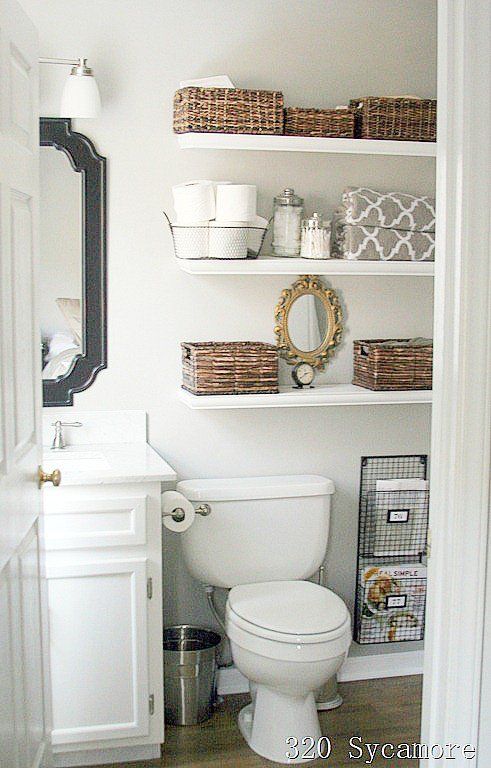
Baskets everywhere


bathroom shelving, baskets

I have  baskets in my home here and there because they are functional, but I am always careful  not to overdo it.  I don't want someone to walk in and think ... the house of baskets.


 Text as art

text art walls

  Yes, I like quotes, I even collect them and I love text.  Their use as art  just seems to be way overdone in the last few years.


Faux taxidermy


faux taxidermy, white deer heads, vignette

 Here's another design  motif  that when  used in the right setting  added an individual note to a space in the past, but not anymore because faux taxidermy is  everywhere and I am still trying to figure out why.  Are you a lover?


Starbursts


dining room starbursts

Another beautiful motif that has reached the boredom point from overuse.  As a lover of circles and rays I would have to think  long and hard before using a starburst in a design right now.  Too predictable!  Another element on my revisit after 5 years list.


Large horizontal stripes


black and white stripes

When this image first popped up on Pinterest I was attracted to the strong graphic nature of the stripes.   Very quickly bold, equally sized and spaced stripes were popping up everywhere especially black and white ones.  Nothing was sacred as they appeared  on walls, rugs, pillows, tables etc.


And how about you?  Do you have design elements or objects that you think need a rest?  Perhaps you love some of my "tired" choices and want to argue for their continued use.


2016 Home decor trend checklist

I can't believe that December whizzed by without much thought to home decor  blogging.  The holiday season always puts things on hold. I have to make up for that with a good summary of what 2016 holds in design trends for the home.

 How do I know what to write about trends? A good question for sure. Knowledge comes from a lot of reading and looking and being a good synthesizer.

  A trend is never  for one year;  all I have to do is look back at what I wrote last year to realize that everything still holds true.  When I write about trends I  like to write about broader patterns I notice in  home decor  that I feel have some staying power.

There's nothing earth shattering to report for 2016, but there's usually not major shifts.

Plants  and plant motifs bring the outside in  


 Home decor trend plants plant motifs

You can also see the use of blue, wire furniture, and natural woods carried over from last year. 


Pastels are still creeping in usually mixed with soft whites

Pantone's 2016 colour of the year duo supports this.  I'm not saying I love this look but I do like the softness of the colours., there's just too much baggage attached to pink and blue.  Take either separately and I am fine, especially that periwinkle blue.  


Pantone 2016 colour of the year


pastels bedroom nude pink mint green

 Here we see the nude pink with mint green (hello 1980's) and blue accents.   Notice the plant!

Adding texture using organic materials 

 It could be fur, woven textiles from natural fibres,  wicker,  rushes, or plant life.  All add that exciting layer of texture that every room needs for interest and excitement.

texture organic materials
Censationalgirl 


Hope you noticed the liberal use of greenery in this space too, and the white walls and furniture. White is the perfect backdrop for showing off textures. 

texture 2016 fur natural fabrics
source 

Warm metals in  accessories, fixtures and lighting 

I know I've been saying this for three years, but each year the presence of warm metals becomes more noticeable.  Also consider burnished brass, copper and rose gold.  

warm metals lighting art work


This is a totally trendy room,  nude pink undertones, lots of texture, warm metals, natural fibres, plant life and light walls. And the opposite is also trendy....

Dramatic walls and rooms

This is in direct opposition to the white/light look for walls and furniture.  But drama can be embraced.  It's not for me at all, but it is a look that appeals to many people.  Navy walls are particularly fashionable as are black and rich greens.  


dramatic rooms gold texture black walls


black walls white dining room dramatic rooms

These are trends from 2013 -2015 that are still going strong:

  • geometric patterning 
  • nature inspired motifs especially florals 
  • reclaimed/eco-friendly material
  • wire framed furniture and lighting 
  • use of mixed materials in furniture  ( marble and wood, metal and wood etc. ) 
  • global inclusiveness  ( products from different cultures)
  • highly patterned tile
  • artisan products ( hand made) 
  • nude pink and deeper blues.  
And there you have it.  Lots of things to consider and choose from or just go on your merry way doing what makes you happy in decor.