March is the month when my heart beats a little faster because spring is on its way and opening our summer place begins to be a reality. Each year at this time I plan what the coming year will bring in repairs and DIY projects. This post summarizes some of our past projects and how they have come together to create our special place. It is modest and quite ordinary looking when viewed from the outside, but we have a million dollar view, and an interior that reflects our interests and skills.
We are perched on the edge of the Atlantic Ocean on the Bonavista Peninsula in Newfoundland and through the seasons we see icebergs, seabirds, whales and beautiful full moons. One October I even saw my first display of the Northern Lights. Come along for a virtual visit to Ryall's Seaside Home and Studio.
View outside the studio window mid summer
After the storm
Full moon over Bonavista
It's a magical place and it hardly matters what goes on inside, but over our years here things have evolved to reflect who we are and what we think is important. While some things happened because of circumstances and individual interactions, many of our decisions were based on principles we considered important for us. Perhaps you will find them helpful if you are starting on a summer house adventure.
Look outside for colour scheme inspiration
Before we ever put plans on paper, the colour scheme was etched in my mind because of the time I spent in the community when I was younger. The inside is a continuation of the outside - ocean, pink slate, meadow, beach and fog. It goes without saying that you need to do all the painting yourself!
The slate helps tie the colour scheme together and references the prominent hills visible from most of the windows. I choose purple (taken from the slate) for an accent wall behind the cabinets and on the wall behind the dining table. I'm not fond of accent walls, but I felt the room needed a bit of energy, and paint is always an inexpensive way to create effect. I also used colour blocking as a way to transition from room to room and create visual interest in this small space. To me it feels like a walk on the beach with the slate hills backing the ocean.
Decide what's important
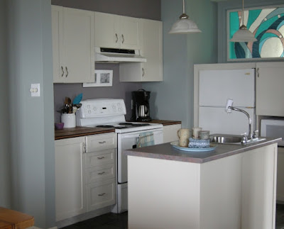
The whole floor plan revolved around the placement of my art studio to avail of north and east light. That left our kitchen area very compact, centrally located but quite functional given its size. There is also a built in buffet opposite the kitchen and additional storage in a pantry closet. Our splurges were the slate floor and the butcher block counters, so the cabinets were built on a shoestring budget using shelving laminate and doors purchased at a salvage store. They were finished with a colour wash and varathane.
The wood floors are local spruce stained with the same wash, and protected by five coats of water-base varathane. They have held up exceptionally well considering we never remove our outside footwear.
The wood floors are local spruce stained with the same wash, and protected by five coats of water-base varathane. They have held up exceptionally well considering we never remove our outside footwear.
After 13 years the cabinets started to turn very pinkish and I repainted them this past year with Benjamin Moore's Advance in Winds Breath (one of my favourite dirty whites). At the same time I painted out the accent wall and promptly changed it back. It just wasn't the same space without it. So much for refreshing my decor.
 |
| Designing Home: Kitchen cabinets BM Winds Breath |
Decide what you can do yourself
You would be surprised what you can do yourself with a little help from You Tube! Make a list of the things you are willing to do and get yourself educated if you can't do them already We laid our own tile and slate, put down the wood flooring and finished it, painted every room and made and installed the door and window trim. That was all before we started to make or alter furniture.
Use your skills to create unique pieces
Everyone has interests and skills that can be used to create individual, unique spaces. Use them in your own space. My friend is a quilter and when I go to her house, that shows. Our particular skill set is art, stained glass and carpentry. My on-site handyman/partner created the beautiful stained glass over the refrigerator to let light from the porch area flow into the central kitchen. His handiwork continues in the dining area.
 |
| Designing Home: Table from reclaimed wood |
The table and bench were made from lumber salvaged from a hundred year old building being demolished. The dining area is across from the kitchen and the purple accent wall continues. Our mid century modern chairs were saved from a trip to the dump when a local company was renovating their offices. You can probably tell we are not interested in perfectly matched sets of things.
My frequent trips to the beach has resulted in a soaring sea glass collection. Apart from storing it in a large glass jar, I wanted to highlight the range of colours and shapes in a sampler. You can see the end of it under the painting. The stained glass piece beside the window is reminiscent of the various ocean colours outside the window. The driftwood came from a local beach.
Consider function first
I still can't believe I bought this sofa and chair! It is cuddly, puffy and brownish - not at all what I am attracted to. Function won out over all my aesthetic beliefs. I gave up on my dream of a white slip covered sofa as not conducive to gardening, wood working, hiking and painting. This one was durable and cheap. I'm learning to like it.
The trunk was built by my father when I was a teenager; he was a thrifter too. It is a coffee table, storage space and ottoman all rolled into one.
Use your interests to accessorize
The most interesting objects in your home are always the ones that reflect the interests and individuality of the people who live there. Going to a big box store might give you lots of options and showcase interesting objects, but without connections your purchases will look flat and sterile.
This vignette sums up our summer lives and connections. The lamp is a cast off from my daughter, and it needs a lighter, textured shade that will come in time. The antler was picked up by a friend on a hike along the hill that backs our house. It sat outside for years and is bleached and subtly coloured. I love the rhythm of it with the other natural references on the table top. The jar contains large shards of pottery collected from beaches in the area. The carved sea gull is a pal for the ones that constantly swoop outside the window. The assemblage was created from bits of wood from beach walks over thirteen years, and we love our local birds, trees and wildflowers.
From pussy willows to a boot remnant each object on this studio table has a connection to me. The books reflect my art interests. My sister gathered the pussy willows for both of us. The starfish is another ceramic love, and the colour, texture and shine work nicely with the natural materials around it. A visiting friend was beach walking and found the plastic glasses frame and the side of an old leather boot and gifted them. Their presence reminds me of the changes that the passage of time creates in the world and the importance of friendship.
Look at old things in new ways
This table was left over from the days when covered tables were all the rage. I quite like its broom handle style legs and I love circles. Obviously it had things going for it in my mind. I used left over paint from the house and tape to create a bullseye pattern; the pattern adds a little punch of energy wherever I place it. It's not all savings in our house, fine craft and original art are my weaknesses. Remember the adage above, decide what's important.
The dresser in our bedroom was purchased at a second hand store. I described its transformation here. I just knew it would be spectacular in gray. Warning: Sometimes new hardware can cost more than the original purchase. The lamp was remodelled from another second hand purchase and it's transformation is in my previous post. The beach assemblage is one of my current pieces.
 |
| Designing Home: Bedside table from hotel furniture |
When we built the house, a second hand store we frequented had a whole stock of night tables from a hotel that was being refurbished. They were solid wood, right down to the dovetailed drawers. Unfortunately they were a harsh brown with a laminate top and black metal. Look what a little re-visioning can do. Stix primer will adhere to anything, and spray paint is my go to for metal.
 |
| Designing Home: Repurposed louvered doors |
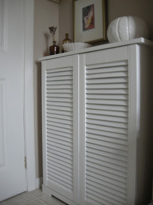
Our main bathroom didn't have any storage, but it had a small alcove area. We reused the top half of louvered closet doors from out town house to create a cabinet for cleaning materials, supplies and extra towels etc. It also provided a place to display more of our objects from seaside life and travels. Check out more louvered door ideas for summer homes in this post.
My studio is an accumulation of bits and pieces of altered furniture to suit my needs. My painting desk is an old computer table with a rolling cart pushed under it for storage. Over the years the table top became stained with paint so I covered it with a vinyl adhesive. It is so much more restful than the black one. Its placement under a window allows for optimal scenic view and light for work.
 |
| Designing Home: Studio table from computer desk |
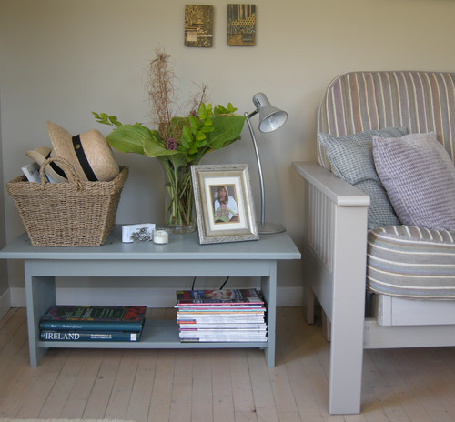
This table started out as one of two built -in night tables for my daughter's bedroom over twenty five years ago. It has had three lives since then. It was just the thing to bank each side of the futon in my studio. Love furniture you can paint especially for an informal summer look. I also like the extra storage for books and the large top for display and some handy storage. Our two hats kept falling off the closet shelf so now they have a new home.
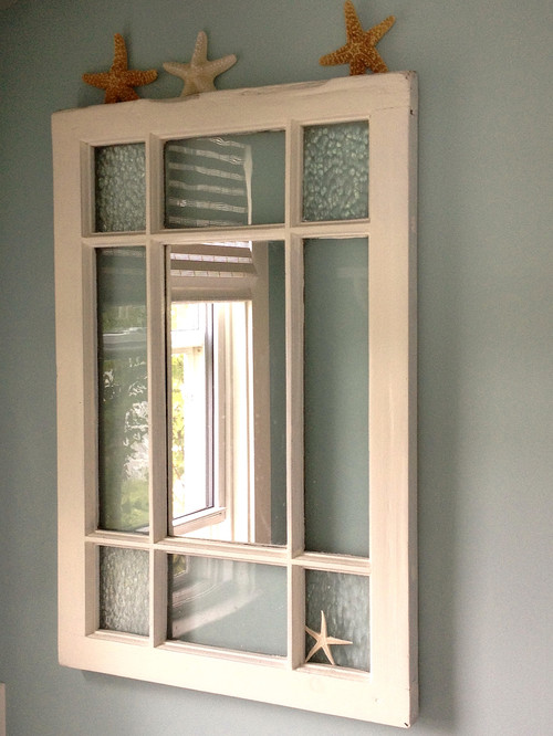
A friend asks for your help and you come home with a gem. This old stained glass window was headed to the dump, but my husband knew it would serve some higher purpose. We removed the broken coloured glass and replaced it with clear textured glass and added mirror to the middle pane. It is one of my favourite pieces in the whole house.
And there you have it, 13 years of re-inventing materials to create a relaxing, cozy, budget friendly summer house.


Tidak ada komentar:
Posting Komentar