Feeling fall

 I am slowly letting go of my summer house and  all its leisurely pursuits including art.  This piece found a new  home in Montreal.  I was sad to see it go.  It reminds me of a bird in flight in fall.


Margaret Ryall 2016 Composition in Time #22

 I had a holiday in New York that left me wanting more of those leisurely pursuits on the edge of the Atlantic Ocean, and when I came home fall was suddenly in the air. Before I could even make a list  of all the things that needed doing in my St. John's house, Thanksgiving was looming and I had to add a little fall colour.


Thankfully nature helped outside.  I had a lovely display of colour in my planter and could even visually "claim" the maple tree across the street.


 My one proactive  fall decor effort before my trip was a flop. My pot of fall flowers had to be laid to rest when I got back.  A frantic trip to the storage room yielded a  generous supply  of fake fall foliage and an old wreath that has been called to work many times.  Other years when I am less rushed I use natural materials in my outdoor arrangements.  


My art collection never lets me down and fall colours abound for some reason.  Like this lovely mixed media piece by Newfoundland artist Anita Singh who is represented by The Leyton Gallery.  Can you find the hiding moth and the bronze cones?


 And this piece by Newfoundland artist Mike Gough that definitely evokes thoughts of the landscape in fall.


From day to day I move objects around just to keep things interesting.


And then there's my antler that gets called upon for many jobs.  Sometimes on the table ...


sometimes on the floor.... 


And a plant never goes astray in a house. My little crystal bird always seems to be right for the season.


As you can see, I don't put much effort in to my seasonal decor.  How about you?

From glam to calm and points in between


Are you someone  who loves pretty, sparkly, elegant, or glamorous in home decor?


 Do you love to continually redecorate, change with the seasons etc. Are you someone who loves accessories?  Many people have this "refined" up to date, concept of beauty and want their living spaces to reflect that.

Believe it or not, there are also people who are equally determined not to have spaces that are perfect and new. They like more pared down, earthy, calm environments that have "real" objects in them.  Some refer to this look as zen.


As in all things there is usually a middle road that people like to take.  I am certainly not, nor never have been, attracted to glamorous spaces, with silk, sparkle and too much excess.  Comfortable, calm and clean lined is more my vibe.


I have always found the Japanese world view/aesthetic of wabi sabi that acknowledges three simple realities: nothing lasts, nothing is finished, and nothing is perfect, very freeing. Such beliefs allow you to accept the dents, scratches, wrinkles, splits, cracks and scuffs as part of the history of a piece that makes it unique and authentic.  If you want to know more about wabi sabi check out this post.


Natural materials predominate in wabi sabi homes: paper, aged wood, linens, cottons, etc. Look for anything that celebrates the  marks of time, weather, and  the effects of loving use. In other words look for objects with history on their surfaces.

 I am definitely attracted to the tenets  of wabi sabi, and if you went around my home you would see subtle evidence of my interest in the marks of time, wood, and natural materials like cotton and linen.
But you would also see pristine, light, glass  and leather.  For me combining new and old  is also a statement that  probably brings more attention to the less than perfect objects and what they mean.

I find spaces that have obviously combined the up to date with the old and authentic very interesting, and I think about them as approaching wabi sabi rather than fully embracing it.


An old door made new with yellow


A less than perfect stool in a white bathroom


Pristine white sofas paired with antique, simple tables and a wooden bowl.

An updated but old space with remnants of the world outside displayed.  


Modern art paired with a rustic bench and less than perfect but evocative pottery. 

Isn't  great interest created when you set up comparisons in your space?  

Choosing what's important

Summer is officially over.

Did any readers notice  I took an extended holiday away from Designing Home blog?

This is where I spent my summer.


The little speck of a house in the background is my favourite place in the world. The views are spectacular and the ocean in all its moods speaks daily.  Duntara is as close to heaven as you will get.

I had a marvellous summer full of creativity, conversation, relaxation, long walks roaming the beaches, whale watching and iceberg viewing directly in front of the house and on and on it goes.  I'm coming to fall with a renewed focus on my art practice.  It feels very satisfying. 

My new work continues to focus on  what gets left behind, but I have moved from two dimensional works to three dimensional using found wood and objects to explore Compositions in Time.  


wood assemblage, wood collage, found materials,
Composition in Time #22,  2016, Margaret Ryall , wood assemblage, 16 x 16 in. 

wood assemblage, white wood, remnants,
Composition in Time #27, 2016, Margaret Ryall, Wood assemblage, 16x16in.

white and blue wood assemblage, reclaimed wood
Composition in Time #29, 2016, Margaret Ryall,  wood assemblage, 16 x16in. 

For more work check out my website   


Designing your IKEA kitchen

We are out the other end of our IKEA kitchen design & install and hindsight, as you know,  is a wonderful thing. Our family joke is now we are ready to tackle an IKEA kitchen. This is the first of a series of posts around the design and installation of our new kitchen.


 Design is key

Without good design any reno is throwing good money after bad.  If you haven't really thought out how you want to work in your kitchen,  and how you want it to look overall, no matter how well you install it, you won't be happy


 I hope some of my musings, and what I learned as I worked through the design process, will be helpful to you if you are planning an IKEA kitchen as a renovation project. 

Get what you want by designing well 

Know what's hidden

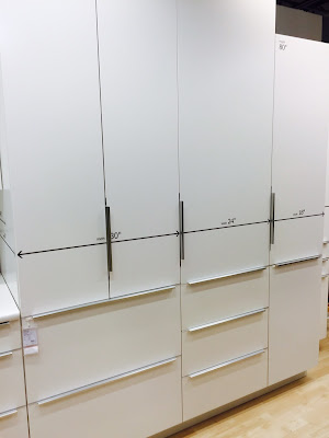
Know the bones of your kitchen  so there'll be no surprises. We wanted 90 inch pantry units and had a bulkhead with pot lights in it.  I kept nagging my husband to have a look, and I was so glad because to our surprise we found vent work.  Just enough to cause me to move to 80 inch pantries.  Not a happy camper letting go of my floor to ceiling pantries, and needing more filler pieces to accommodate what was available in that height pantry.

We were also planning to keep our current footprint and we knew that the flooring did not extend under our cabinets. 

That meant we had to get all our cabinet measurements correct and use fillers to make it come out even.  If you have an island or peninsula and are keeping your existing flooring,  it is even more important to do careful measurement in terms of depth. We found out we could not have a toe kick on the back of the peninsula so the cover panel had to extend to the floor.  


Analyze your current kitchen 

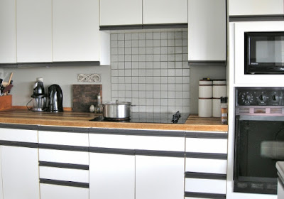
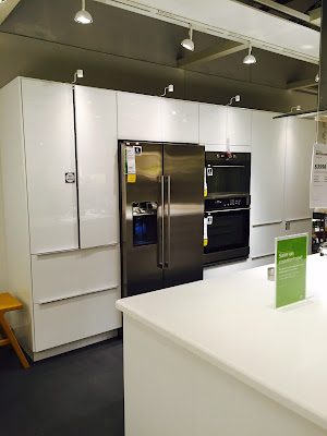
Make a list of what works and what annoys you in your current kitchen layout.  For everything that annoys you, you should try to come up with a solution if possible. It is easier and more cost effective  to keep appliances where they are, but sometimes their placement is part of the inefficiency. Our cooktop and oven were in a major traffic area, and it was downright dangerous when we entertained.   You could also see the stove top from the dining room; I am not a tidy cook. We chose to flip the refrigerator to the cooking area, and make that area into a wall of pantries with the refrigerator centred.  The perfect solution to storage in a walkway.


80s kitchen, European cabinets, updating European cabinets
80s cooking area 
pantries
Standard sizes for pantries 

pantries
Fridge and pantries


European cabinets, 80's kitchen, updating european cabinets
80s layout of kitchen across from cooking area 

Moving appliances meant hiring an electrician, but it was worth it. 

 Everyone expected me to move my sink under the window, but that would have meant a very squat prep area if the stove moved to where the fridge was.  When I stand at my sink now I have a view of two prominent St. John's landmarks - Signal Hill and Cape Spear.  Why would I want to exchange that for a view of my neighbour's house? Now I have a huge prep area and I can make all the mess I want when I entertain.  Perfect planning!

Several friends brought up the idea of "updating" to an island.    I like my kitchen to myself when I cook, even when I entertain.  No island for me, and it could have happened in the space without too much effort.  Personal choices are important in design.  I made an entertaining hang out area by removing the half wall in pic below and opening it up to the family room. 


Another big problem for us was  a bottleneck area  at the end of the peninsula because of a contractor error in the initial construction. The wall by the oven was  built 10 inches too long and changing it was complicated and expensive because it contained pipes, heating and air exchanger vent work, plus light switches.   When we redesigned we took three inches off the length of the peninsula to open up the walkway.   That was possible because we had floor tile left over.  

Visit an IKEA store 

By chance we ended up grounded for 24 hours in Toronto when returning from a trip.  We took advantage of that time ( a year before our reno) to check out everything kitchen related.  I took over a 100  pics of things that interested me, and  I kept referring to them as I designed.  If you can't do that, find someone who has designed and installed an IKEA kitchen and go for a chat.  I managed to find two people who were obliging, and it was helpful even after the store visit. 

Start a reno board on Pinterest 

Look at various IKEA kitchen layouts and cabinet styles online.  Think about  improving storage options especially if you have a smallish kitchen.  Pinterest is a great resource and you can pin everything you see on one board.  Consider a secret board so you can make comments and track ideas or a shared secret board if you have a design partner.  Check out my Kitchen reno board here and a previous post about Finding your decor style.

Find inspiration pictures

Your kitchen should meet your needs in style and function.  Make it yours.  Here are two pics that helped me refine the look I wanted. They are not everyone's cup of tea!


Create a vision 

Many people just go headlong into a reno and don't stop to think about their design aesthetic.  What kind of feel do you want in the space?  What style of cabinets and layout suits that feel? What is the rest of your home like?  Are there interior aspects of the cabinets that will add to how you want to feel in your space? 


After all the cabinets and gray horizontal lines in my old kitchen I wanted something  visually quieter this time around. 

 The two photos above illustrate "the feel" I wanted : uncluttered, quiet, airy, bright, calm and minimal,  but with elements of warmth and nature. These are the words I kept in my head throughout the design process.  I wrote them  down and checked my decisions against them constantly.  You will probably have other words entirely, but have  descriptive words as benchmarks for decisions.

I really wanted a kitchen that flowed from the rest of our house  and reflected our arty, organic and calm decor style. 


  • Uncluttered ...lots of thought to interior storage options and eliminating "stuff" you don't need 
  • Airy ... an absence of upper cabinets so your eye moved around the space 
  • Calm and bright...  from colour and style choices and layout
  • Warm and quiet ...   no laminate, granite, or other hard surface counters 
  • Organic...  from natural products like wood, cork, plants etc.


 Stick to your vision 


A reno is a headache in many ways, and you will reach a point where you are fed up and want to take the easy way out.  Don't.  Take a break from it and look at the problem with fresh eyes.  Make all decisions based on your initial concepts for the space.  


Work out a rough sketch on paper

Perhaps it's my age and my visual art training, but I begin everything with paper and pencil.  I found the kitchen booklet  we picked up at IKEA a great help when doing this because all cabinet sizes were listed and you could plainly see what was inside  each one.  There is an online version.  I didn't spend a lot of time at this stage,  just enough to decide on the flow and placement of drawers or doors. 

Refine your sketch in the kitchen planner

I work  with design apps all the time, but I found the IKEA kitchen planner very frustrating.  It had lots of little glitches, and if you have an island or  peninsula as I did, the cabinets kept wanting to line up by a wall.  I was also working on a MAC.  In the end I refined the plan enough to send to IKEA and get the order made, but it never looked pretty.

 Imagine working in your new kitchen 

Once you have a preliminary design in mind, consider it the next time you bring home groceries.  Is there a place for everything.  If you are entertaining, is there a place for all those things you only use every now and then?  Prepare an imaginary meal and clean up. Are your movements efficient? Have you solved all the design issues in your previous kitchen?

Explain your design to someone outside your family 


Walk through your design with someone outside the family and explain your layout decisions. This really helped me confirm that I wanted things the way I thought.  You also have an opportunity to question the IKEA staff when you order your kitchen. They were super helpful when I called.


Record your questions before IKEA ordering 

I had at least ten questions recorded for clarification when I called to place my order.  Many of them were of a confirmation type, making sure I had interpreted the cabinets properly and that I could do what I wanted to do. 


And yes, you will have more than one design.

 I'm happy to answer any questions or hear your comments about your IKEA kitchen design suggestions. 


The big reveal is coming up in the next post and yes, it was worth all the thought, frustration and mess.... 


Finding your decor style

Have you ever looked for similarities in rooms you are attracted to in magazines or online?
That's one of the best ways to determine what you like for your own decor.  If you don't know where to start here are several suggestions to set you on your way to finding your personal decor look.

Develop a vocabulary for your style 


Initially you may not have the words to describe  why you are attracted to a space or why you find it interesting, but you will over time if you do enough looking and comparing.


  1. Start with some rooms you  don't like at all. 


When you have about 10 or so look at them and decide what you don't want in a space.  This is just as important as what you do want.

Here's a room that doesn't  particularly ring my chimes because it has too much glitz and materialism.  It reminds me of  a woman who has on too much makeup and bling,  but there are lots of people who love a glam look.  I'm not judging, just saying it's not for me.


glamorous living room

 2. Have a category for rooms that you like aspects of


     It might be the furniture or the fabrics or layout.  It could be how it is accessorized. It could have one thing you like or a number of things.  Identify what you like and don't like.

interesting vignette, creative vignette, Caleb Anderson
Caleb Anderson 

You can be attracted to a space and not like all the components of it. I appreciate that this space is dramatic and artfully conceived.  Dark wall colours are not part of my aesthetic nor is traditional decor, but I find myself drawn to this space. Why?


  • mix of  some traditional and modern (furniture and art)
  • accessories in vignette combine colour, texture, form and  different styles
  • the perfect intersection of chair back with art  making the chair an integral part of the vignette
  • there is nothing cookie cutter about this space; it's totally individual /unique
  • the variety in the vignette arrangement takes my eye back again and again
  • it is the opposite of what I like usually (light interiors, clean lines and more minimal look) 

3. And most importantly find rooms you love


 Here are some spaces I love from recent pins on Pinterest.

Room #1

geometric white and black tile, modern kitchen, flat panel kitchen doors


 This room couldn't be more different than the one above!  It is a space that I think is timeless even with the bold tile choice.

Here's what I like about it:
  • simple geometric patterning in neutrals 
  • simple lines in flat panel doors
  • mix of open shelves with doors to provide some visual relief
  • mix of wood,  white and geometric to add interest 
  • this would be in style for years

Room #2 

black and white patterned pillows, Scandinavian living room,

There are similarities to the kitchen above if you really look. Here's why I find this appealing:

  • mix of warm wood and neutrals
  • a room has to have at 3-5 different patterns for me to find it interesting
  •  a touch of the outside is important to me (plants and wood) 
  • lots of textures
  • pared down but inviting because of the rug and the pillows

Room #3

black and white bathroom, black mosaic tile, wood in bathroom,
Such a great space:

  • white, black and wood
  • it looks like a well composed abstract painting
  • very geometric in layout, especially the vertical window and cube lights
  • the mirror connected everything visually 
  • like how the sink is like a piece of furniture, not hidden
  • this is a unique space

 Establish a my style and not my style boards on Pinterest 


I find it useful to have one board on Pinterest that focuses on my style. I am selective in what I put in there and often go back and delete things until I am left with what I find pleasing. If you don't want to have it open for all to see, set up a secret board and record negatives and positives without insulting anyone!


Find your look/style by doing quizzes online 


This is a short quiz and was spot on for my style when I completed it.  You have to provide your email address to get your answer. 

There's a range here from Houzz to Lonny and  Better Homes and Gardens. 


I hope these simple suggestions will help you define your decorating style.  We are all unique and that's what you should aim for in your home.   Go for it!

Bring on the green


St. Patrick's Day gets lots of attention where I live because so many of us have Irish roots.  While the partying and music happened last weekend, I'm doing my own bit today by recommending green as a colour to consider in decor if you like to bring the outside in.  When someone says they hate green, I'm  flabbergasted.  How can you hate the the most prominent colour in nature?

You can have a little green woven in with any other hues and it always looks good.  Think plants.  Is there any room a plant doesn't work in?  Or you can have a green statement piece or green accessories mixed with another colour.  The possibilities are endless when you think about the variety of greens and the proportion of use in a space.

A green statement piece 


green velvet sofa, white walls

A green velvet sofa is daring and this one sings because of the white walls and light artwork above it.  

mint green wooden bed, white walls

This is still a statement in an otherwise white room,  just a more subtle one. 

Green  furniture and accents 


white walls, green accent wall, green sofa, leaf roman shades

I am more drawn to yellow greens like the ones in this space.  Love the leafy references in pillows and romans.  This much green needs the relief of white walls.  I would like to see more of the blue green as a stronger punch of colour.  


Just a hint of green in a neutral space 


green plants, white walls, white furniture

Just the merest hint of accents of green with plants and branches can liven a white space. This little amount of green only works well in very light space. 


neutral bedroom, striped bedding, green throw

You can weave  a little more green into any neutral space and it can either sit back and  quietly warm it or...


yellow green accents, gray bedroom, texture

say, "Look at me, I'm the life of the room".  I'm particularly fond of this colour scheme and the use of texture in the space. 


I guess you've figured out from my photo references that I like green with white and gray.  It's the fresh punch that intrigues me, and for that you need a quiet background.  There are other ways to work  with greens  using lots of black for instance, but then the room gets too shouty for me.  Are you a lover of green?  

7 Tips for creating a DIY summer house

March is the month when my heart beats a little faster because spring is on its way and opening our summer place begins to be a reality. Each year at this time I plan what the coming year will bring in repairs and DIY projects.  This post summarizes some of our past projects and how they have come together to create our special place. It is modest and quite ordinary looking when viewed from the outside, but  we have a million dollar view, and an interior that reflects our interests and skills.

 We are perched on the edge of the Atlantic Ocean on the Bonavista Peninsula in Newfoundland and through the seasons we see icebergs, seabirds, whales and beautiful full moons.  One October I even saw my first display of the Northern Lights. Come along for a virtual visit to Ryall's Seaside Home and Studio.


View outside the studio window mid summer


After the storm

Full moon over Bonavista

It's a magical place and it hardly matters what goes on inside, but over our years here things have evolved to reflect who we are and what we think is important.  While some things happened because of  circumstances and individual interactions, many of our decisions were based on principles we considered important for us. Perhaps you will find them helpful if you are starting on a summer house adventure. 

Look outside for colour scheme inspiration 


Before we ever put plans on paper, the colour scheme  was etched in my mind because of the time I  spent in the community when I was younger.  The inside is a continuation of the outside - ocean, pink slate, meadow, beach and fog. It goes without saying that you need to do all the painting yourself!


 The slate helps tie the colour scheme together and references the  prominent hills visible from most of  the windows.   I choose  purple (taken from the slate) for an accent wall behind the cabinets  and on the wall behind the dining table. I'm not fond of accent walls, but I felt the room needed a bit of energy, and paint is always an inexpensive way to create effect.  I also used colour blocking as a way to transition from room to room and create visual interest in this small space.   To me it feels like a walk on the beach with the slate hills backing the ocean. 

Decide what's important


The whole  floor plan revolved around the placement of my art studio to avail of north and east light. That left our kitchen area very compact, centrally located but quite functional given its size. There is also a built in buffet opposite the kitchen and additional storage in a pantry closet.  Our splurges were the slate floor and the butcher block counters, so the cabinets were built on a shoestring budget using shelving laminate and doors purchased at a salvage store.  They were finished with a colour wash and varathane.

The  wood floors are local spruce stained with the same wash, and protected by five coats of water-base varathane. They have held up exceptionally well considering we never remove our outside footwear. 

After 13 years the cabinets started to turn very pinkish  and I repainted them this past year with Benjamin Moore's Advance in Winds Breath  (one of my favourite dirty whites).  At the same time I painted out the accent wall and promptly changed  it back.  It just wasn't the same space without it.   So much for refreshing my decor. 
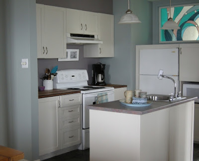
summer house, DIY kitchen, BM winds breath, stained glass transom
Designing Home: Kitchen cabinets BM Winds Breath 

Decide what you can do yourself


 You would be surprised what you can do yourself with a little help from You Tube!  Make a list of the things you are willing to do and get yourself educated if you can't do them already  We laid our own tile and slate, put down the wood flooring and finished it, painted every room and made  and installed the door and window trim.  That was all before we started to make or alter furniture. 


Use your skills to create unique pieces 


Everyone has interests and skills that can be used to create individual, unique spaces. Use them in your own space. My friend is a quilter and when I go to her house, that shows.   Our particular skill set is art, stained glass and carpentry. My on-site handyman/partner created the  beautiful stained glass  over the refrigerator to let light from the porch area flow into the central kitchen.  His handiwork continues in the dining area. 

stained glass in driftwood, seaglass construction, reclaimed wood table, summer house
Designing Home: Table from reclaimed wood


The table  and bench were made from lumber salvaged from a hundred year old building being demolished.  The dining area is across from the kitchen and the purple accent wall continues.  Our mid century modern chairs were saved  from a trip to the dump when a local company was renovating their offices.  You can probably tell we are not interested in perfectly matched sets of things.  

My frequent trips to the beach has resulted in a soaring sea glass collection. Apart from storing it in a large glass jar, I wanted to highlight the range of colours and shapes in a sampler.  You can see the end of it under the painting. The stained glass piece beside the window is reminiscent of the various ocean colours outside the window.  The driftwood came from a local beach. 


Consider function first


I still can't believe I bought this sofa and chair! It is cuddly, puffy and brownish - not at all what I am attracted to. Function won out over all my aesthetic beliefs. I gave up on my dream of a white slip covered sofa as not conducive to gardening, wood working, hiking and painting.   This one was durable and cheap.  I'm learning to like it.

The trunk was built by my father when I was a teenager; he was a thrifter too. It is a coffee table, storage space and ottoman all rolled into one.  


Use your interests to accessorize 


The most interesting objects in your home are always the ones that reflect the interests and individuality of the people who live there.  Going to a big box store might give you lots of options and showcase interesting objects, but  without connections your purchases will look flat and sterile. 


This vignette sums up our summer lives and connections.  The lamp is a cast off from my daughter, and it needs a lighter, textured  shade that will come in time.  The antler was picked up by a friend on a hike along the hill that backs our house.  It sat outside for years and is bleached and subtly coloured.  I love the rhythm of it with the other natural references on the table top.   The jar contains large shards of pottery collected from  beaches in the area.  The carved sea gull is a pal for the ones that constantly swoop outside the window. The assemblage was created from bits of wood from beach walks over thirteen years, and we love our local birds, trees and wildflowers.


From pussy willows to a boot remnant each object on this  studio table has a connection to me. The books reflect my art interests.  My sister gathered the pussy willows for both of us.  The starfish is another ceramic love, and the colour, texture and shine work nicely with the natural materials around it.  A visiting friend was  beach walking and found the plastic glasses frame and the side of an old leather boot and gifted them. Their presence reminds me of the changes that the passage of time creates in the world and the importance of friendship.


Look at old things in new ways 


 This table was left over from the days when covered tables were all the rage. I quite like its broom handle style  legs and I love circles.  Obviously it had things going for it in my mind. I used left over paint from the house and tape to create a bullseye pattern;  the pattern adds a little punch of energy wherever I place it. It's not all savings in our house, fine craft and original art are my weaknesses. Remember the adage above, decide what's important. 


The dresser in our bedroom was purchased at a second hand store.  I described its transformation here.  I just knew it would be spectacular in gray.  Warning:  Sometimes new hardware can cost more than the original purchase.  The lamp was remodelled from another second hand purchase and it's transformation is in my previous post. The beach assemblage is one of my current pieces. 


Designing Home: Bedside table from hotel furniture 


When we built the house, a second hand store we frequented had a whole stock of night tables from a hotel that was being refurbished. They were solid wood, right down to the dovetailed drawers.  Unfortunately they were a harsh brown with a laminate top and black metal.  Look what a little re-visioning can do. Stix primer will adhere to anything, and spray paint is my go to for metal. 
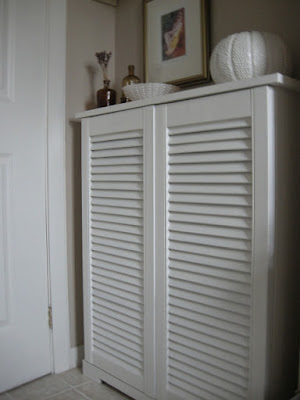


Designing Home: Repurposed louvered doors  

Our main bathroom didn't  have any storage, but it had a small alcove area.  We reused  the top half of  louvered closet doors  from out town house to create a cabinet for cleaning materials, supplies and extra towels etc.  It also provided a place to display more of our objects from seaside life and travels. Check out more louvered door ideas for summer homes in this post.


Designing Home:  Studio table from computer desk 
My studio is an accumulation of bits and pieces of altered furniture to suit my needs.  My painting desk is an old computer table with a rolling cart pushed under it for storage. Over the years the  table top became stained with paint so I covered it with a vinyl adhesive. It is so much more restful than the black one.  Its placement  under a window allows for optimal scenic view and light for work.


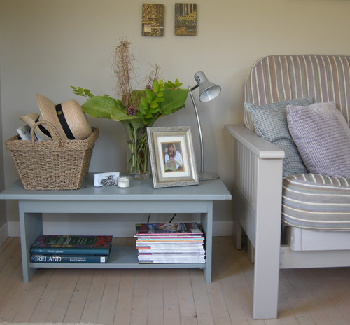
This table started out as one of two built -in night tables for my daughter's bedroom over twenty five years ago.  It has had three lives since then.  It was just the thing to bank each side of the futon in my studio.  Love furniture you can paint especially for an informal summer look.  I also like the extra storage for books and the large top for display and some handy storage.  Our two hats kept falling off the closet shelf so now they have a new home. 


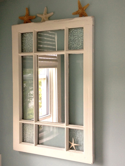
A friend asks for your help and you come home with a gem.  This old stained glass window was headed to the dump, but my husband knew it would serve some higher purpose.  We removed the broken coloured glass and replaced it with clear textured glass and added mirror to the middle pane.  It is one of my favourite pieces in the whole house.  

And there you have it, 13 years of re-inventing materials to create a relaxing, cozy, budget friendly summer house.